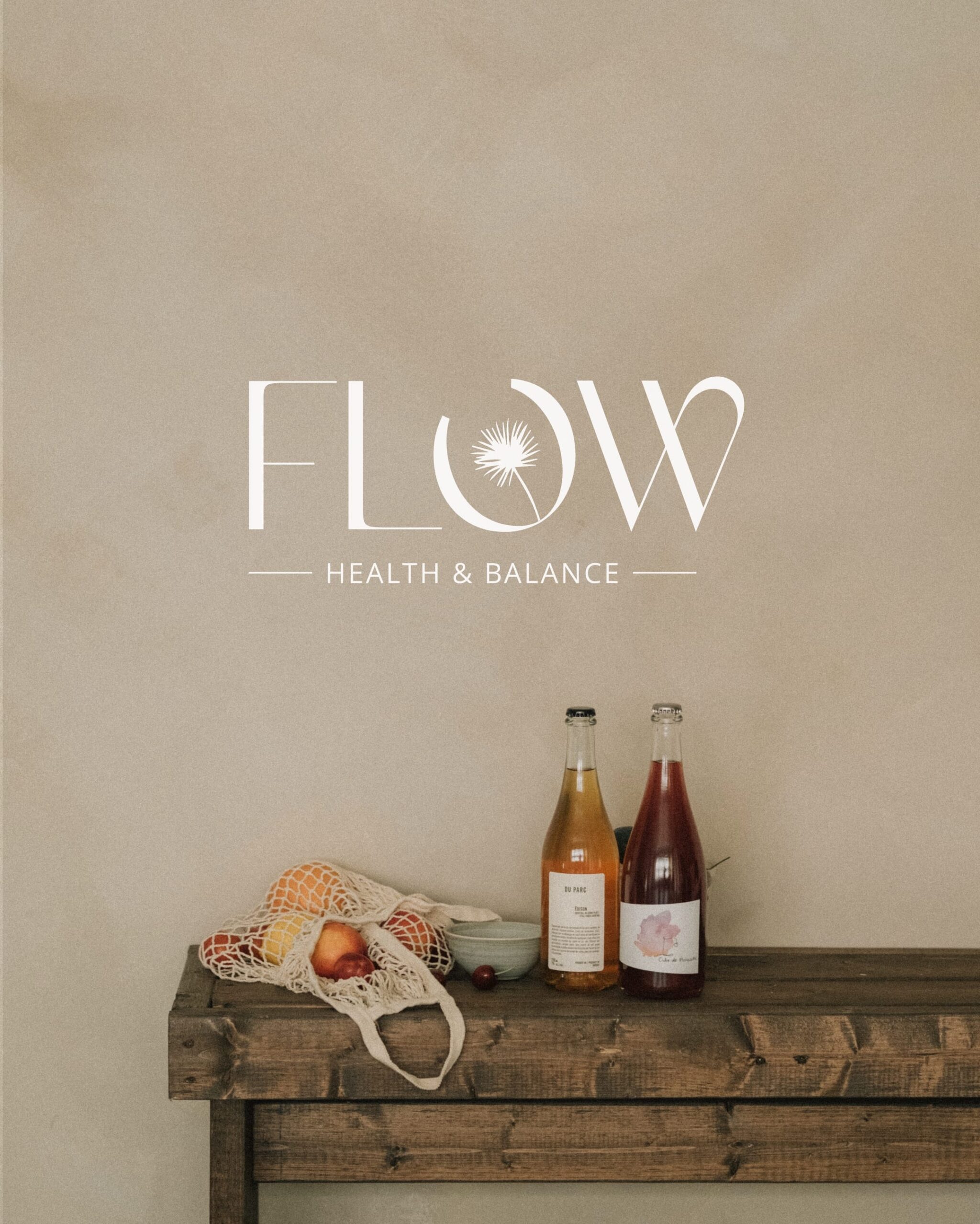
With great passion, we have had the opportunity to create the Branding and Website for FLOW HEALTH & BALANCE. Isa’s mission is to show people how to make their body work for them instead of against them. By living in harmony with nature, we can address the root cause of health issues together and feel fit and energized again. Isa’s enthusiastic approach is contagious and motivates people to understand their bodies and find a good balance.
Branding
~ 🟢🟠 Colors: The green colors represent health, nature, and organic elements. The orange/coral color symbolizes the positivity and energy that FLOW brings to people. Together, they create a natural vibe. The illustrations are once again illustrated in a flow to embody FLOW in every element, which is reflected in the website design. The branding is based on FLOW’s core values:
~ 🌿 FLOW – Health & Balance: Finding balance together in your health.
F – Faith: Have faith in your body’s healing ability.
L – Learn: Learn to recognize and feel your body’s needs.
O – Organic: Let nature do its work as much as possible.
W – Worth: You are worth living your best life.
Logo
The main values of the FLOW logo:
Inside body: FLOW ensures an inside body flow, aligning all internal processes.
Health & Organic: FLOW adopts a holistic and natural approach to achieve health.
Flow: By nourishing the body with the right nutrients, it will return to flow.
~ ‘O’ – The ‘O’ is open, with a flower inside symbolizing the body’s healing ability. The ‘W’ is designed in a flow representing the flow of the human body.
Website
When designing Isa’s website, we were clearly informed that a natural and organic flow is important to her. We used this as the core for the branding, logo, and website design. In the website, we aimed to use Isa’s story as a guide to inspire people to invest in their health.
Isa immediately found herself in the right flow when she saw the website design, which we completed fully with some feedback points.
Experience the flow vibe that emanates from the FLOW website.

