When Amelia came to us, she knew one thing for sure: children’s nutrition should feel fun, light, and achievable again. On Instagram she already inspired hundreds of parents by sharing her daily life as a mom, but her brand didn’t yet reflect the warmth, playfulness, and calm energy that make her way of sharing so unique.
Together, we explored what Kleine Buikjes Vullen truly represents: a place where parents feel seen, where honesty and simplicity lead the way, and where food becomes something joyful instead of another task on the list.
What the name means
Kleine Buikjes Vullen is Dutch and translates to “Filling Little Tummies.”
It’s a name that instantly paints a picture of care, nourishment, and the small everyday rituals in the kitchen. It captures Amelia’s mission perfectly: making healthy food for children simple, joyful, and doable for every family.
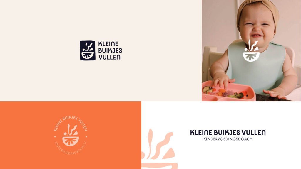
A logo with meaning
The logo captures the heart of the brand. The bowl at the bottom symbolizes nourishment in every form — not only through healthy meals, but through love, attention, and the little rituals that make everyday cooking special.
The playful shapes above it reflect the journey every parent knows: trying new recipes, introducing new flavors, watching a child explore, and sharing moments of learning and laughter together.
The branding
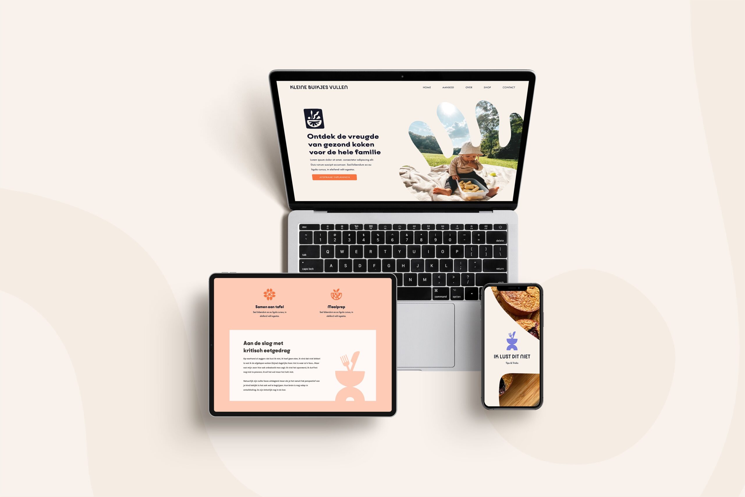
Kleine Buikjes Vullen is built on honesty, joy, and inspiration. We translated these values into a soft, fresh visual identity.
The color palette brings together warm creams, playful lavender, cheerful orange, and the deep midnight blue that grounds the entire brand. It creates a look that feels friendly and familiar, yet strong and instantly recognizable.
The typography is clean and modern, with just enough personality to highlight the playful spirit of the brand.
We also designed custom illustrations inspired by everyday family life: kids at the table, weekly meal plans, eating habits, and recipe moments. They add joy and recognizability, and give Amelia endless freedom to create varied and engaging content.
The result
Kleine Buikjes Vullen now has a branding identity that radiates trust and invites parents in. It reflects exactly what Amelia stands for: healthy food that feels joyful and doable for every family.
A stronger brand, more recognition, and an aesthetic that Amelia is proud to share.
Scroll down to explore the full vibe we created for Kleine Buikjes Vullen.

KIND WORDS FROM THE CLIENT
“Yoni created a complete brand guide and new logo for me. I’m so incredibly happy with the result! She dives deep into your story and vision to create not only the looks, but also the right feels. She helps you gain clarity and understand your ideal client even better. Professional, thoughtful, and truly skilled. All in all – extremely satisfied!”
– Amelia, Founder of Kleine Buikjes Vullen


Ready for more?
Copyright ©2019-2025 Creative Vibes
VOLG & RAAK GEÏNSPIREERD
Portfolio
Contact
FAQ
Over ons
✦ Website templates
Explore
✦ The Full Vibes: Branding & Website
✦ Web-wonder: Website
✦ Brand Build: Branding